
NATIVES LOGO DESIGN
Overview
Native, formerly known as McKenzie's, is a local neighborhood bar in San Francisco's Richmond District. The original owners of McKenzie's sold the bar to a local and wanted to rebrand and update the look and feel of the bar. He changed the name to Natives, referring to being a native San Franciscan. He wanted to clean up the bar, making it more modern and comfortable but also maintain the neighborhood feel that McKenzie's had.
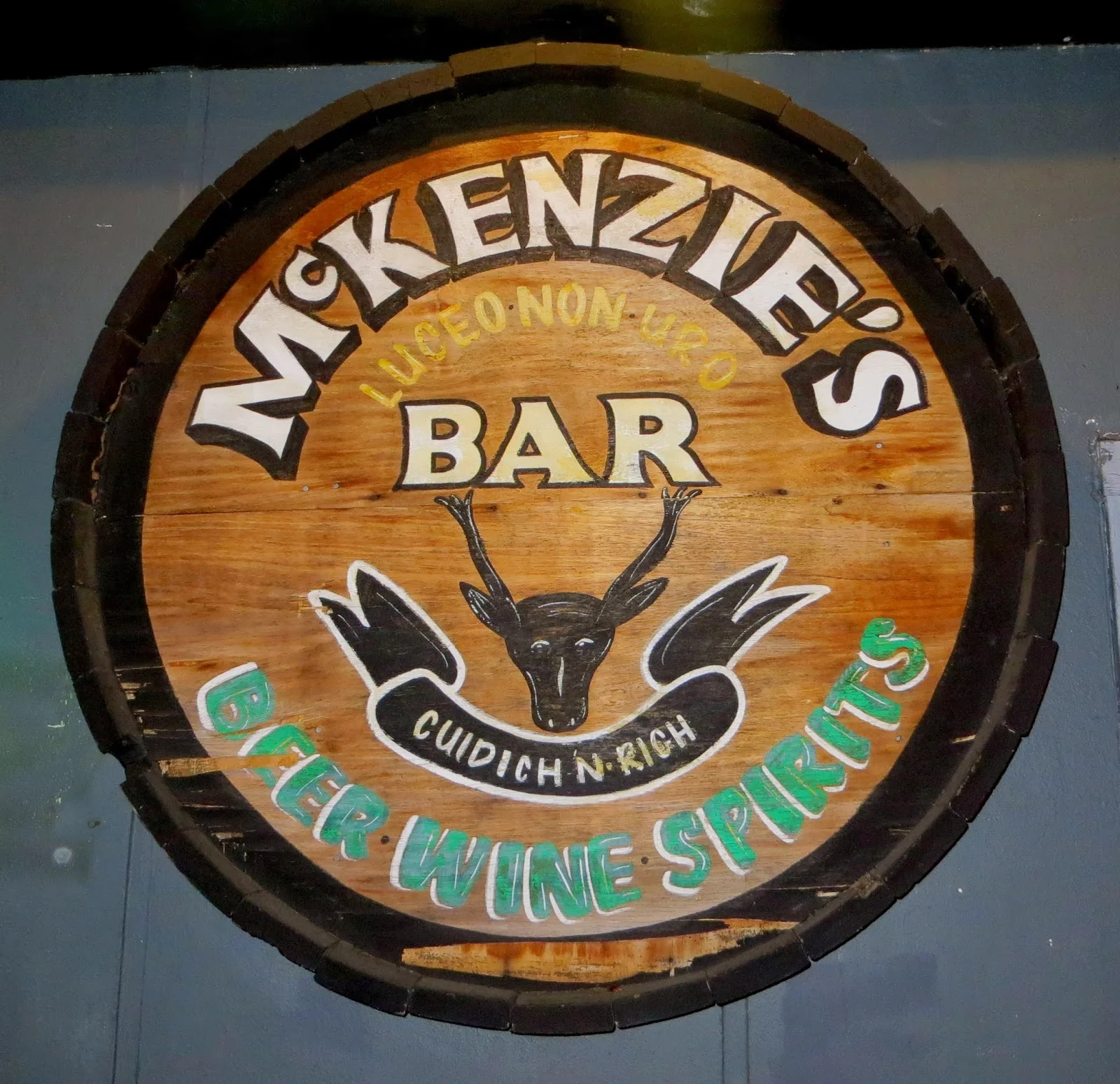
original logo of McKenzie's Bar
Details
When I met with the new owner, he told me he was changing the name of the bar to Natives. He wanted the new bar to look and feel clean and modern and wanted it to represent San Francisco and the Bay Area somehow. He preferred cursive fonts for the logo and wanted the logo to be bold and pop. He had no color preferences, the only restrictions were that the logo had to be in a circle that the original logo had.
Early Concepts
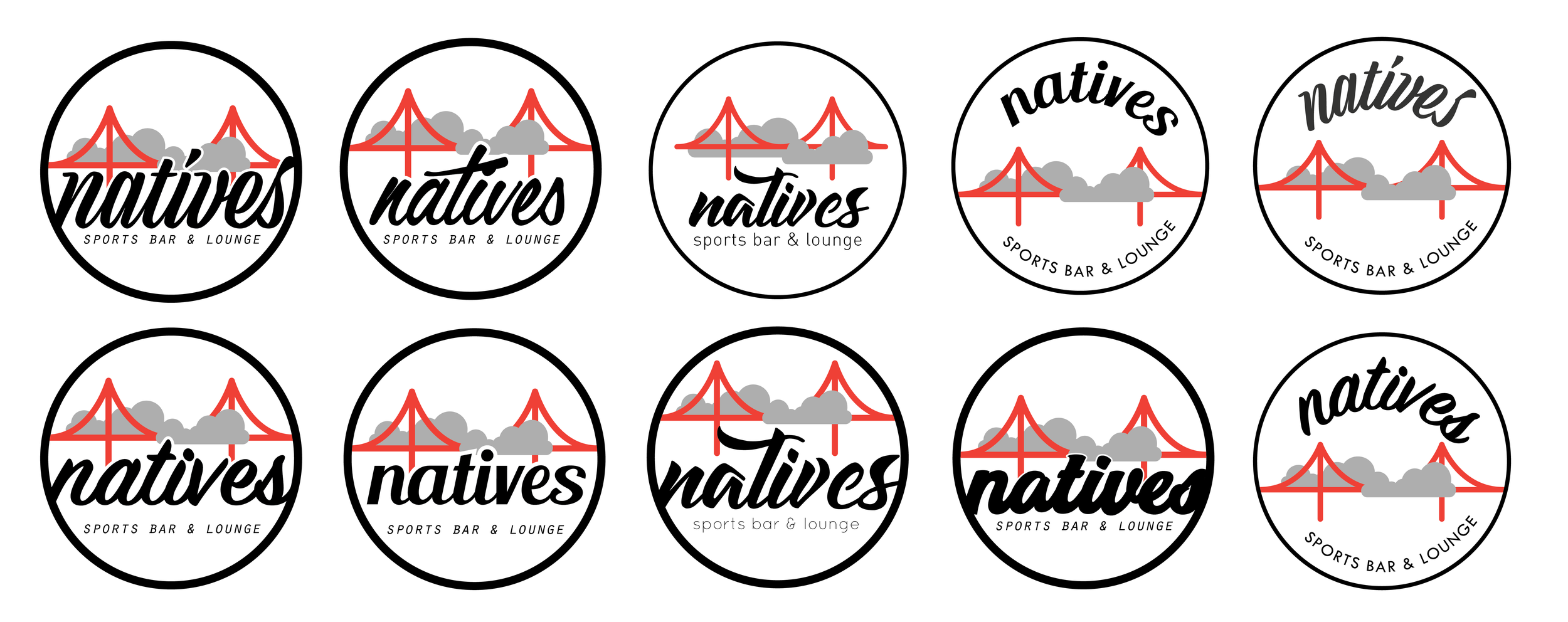
Design
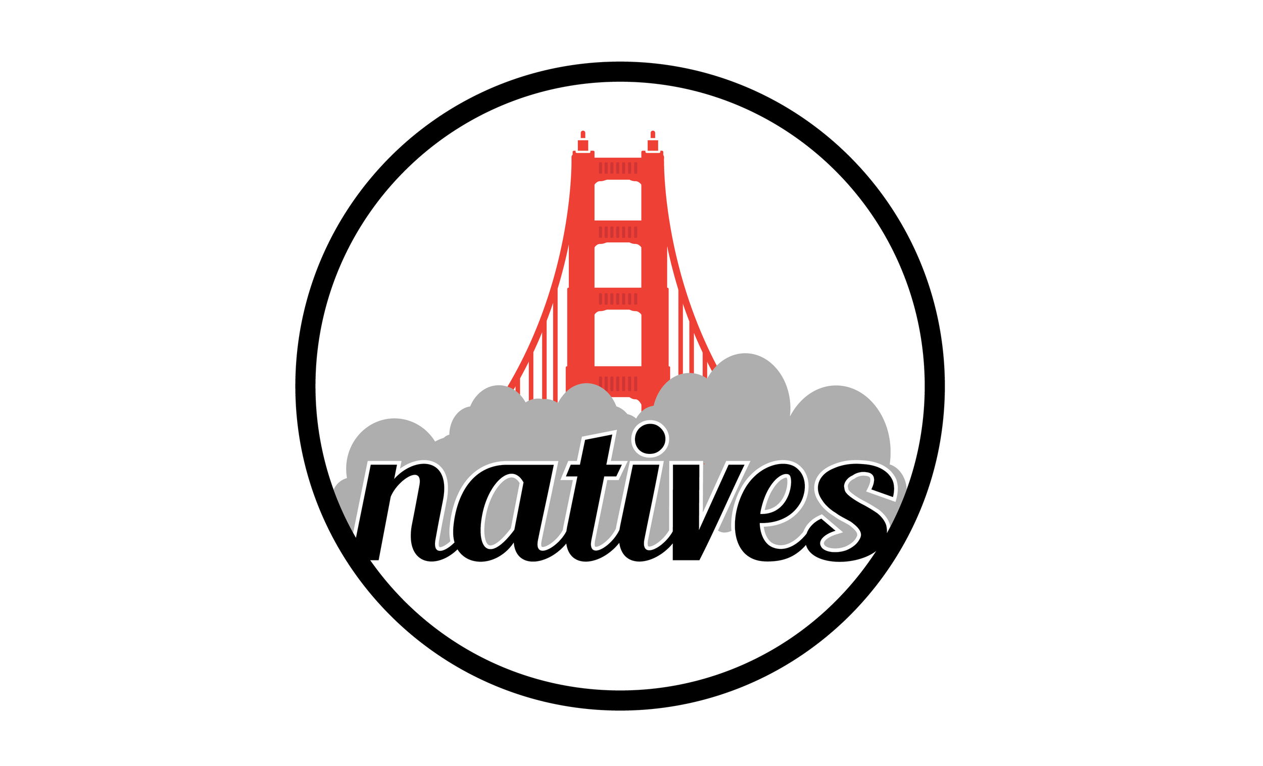
After talking to the owner and figuring out his vision, I tried to think of ways to represent San Francisco. I thought of the Golden Gate Bridge and the foggy weather conditions the city throughout the year. I chose the Golden Gate Bridge color to contrast against a white and black to really stand out. The fog would be a sleepy gray that would compliment the red, white and black. I played around with different ideas and concepts on how to implement the bridge and fog. I wanted to keep it simple and not too detailed and complex. I also explored different cursive fonts that the client preferred. Being a neighborhood bar, my perception was that it should be an inviting bar with no frills where customers can relax and have fun.
Second Iterations
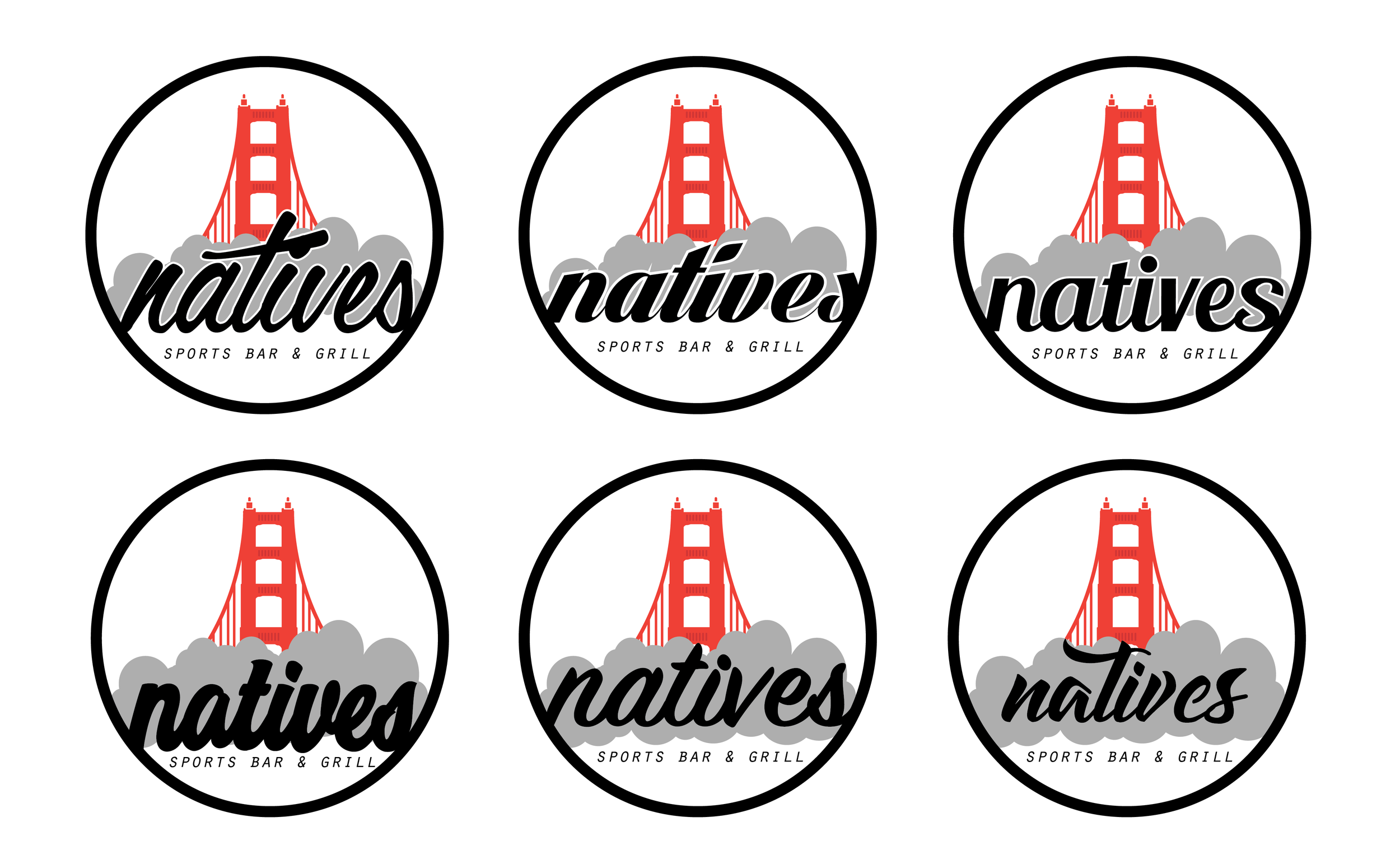
Design
After showing the client the first ideas I had, he liked the designs but still wanted it to pop and be bolder some how. So I tried to find ways to make is stand out more. I decided the original bridge design was too basic and decided to draw the bridge from a different perspective when the bridge is bigger and bolder. I continued to use the fog as a background to the text to help cut down the sharp contrast between white and black while representing the fog.
Further Iterations
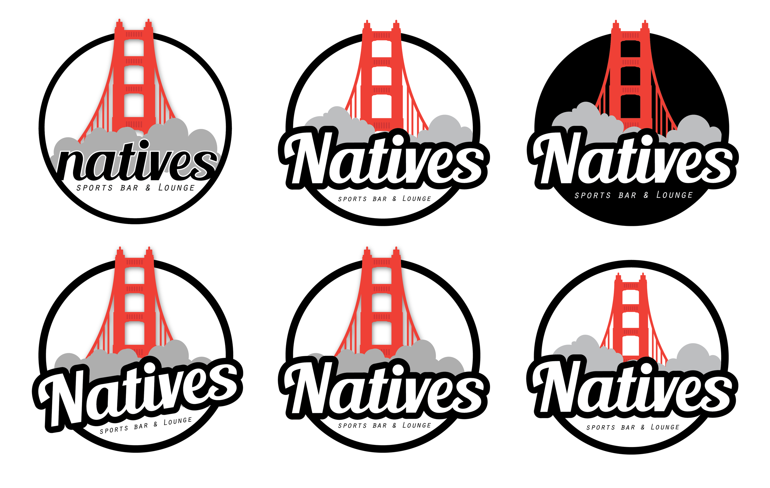
Design
I continued to create more examples for the client where I felt the logo was more bold. By enlarging the text and giving it a thick border made the name stand out more. I also enlarged the bridge and made the both the bridge and name stick out from the circle. Some options I gave a slight drop shadow to show some depth.
After discussing with him my ideas, he came to a decision and chose the design he and his partners liked the most. They liked the clean simplicity and the boldness of the bridge and cursive text.
Natives is aiming to open some time in the Fall of 2017. Stay tuned for updates!