

Overview
BigCommerce is the leading ecommerce platform for fast-growing businesses. They are targeting mid-market companies and want their clients to purchase more apps within their web platform. The problem is that their current site is confusing to use due to the inconsistent information architecture and doesn't offer enough information for the users. This made it difficult for users to process the information which we believe was the leading reason to the lack of app purchases.
By improving the information architecture and providing , users can process the information better thus potentially leading to an increase in conversion rate.
Details
- Team of 3
- Everyone collaborated at every stage of the process.
- 3 weeks to deliver Research, Personas, Sketches, Wireframes.
First and foremost, we had to understand the current situation. We created an account on BigCommerce and set up a website as if we were starting an online website. We searched through the app marketplace and did an affinity map.
Next, we gave users a scenario and asked them to go through the process. We ask them questions and had them talk about their experience in order to gain more insights. Some had similar issues that supported our thoughts but there were also some new problems that were pointed out to us.
Research
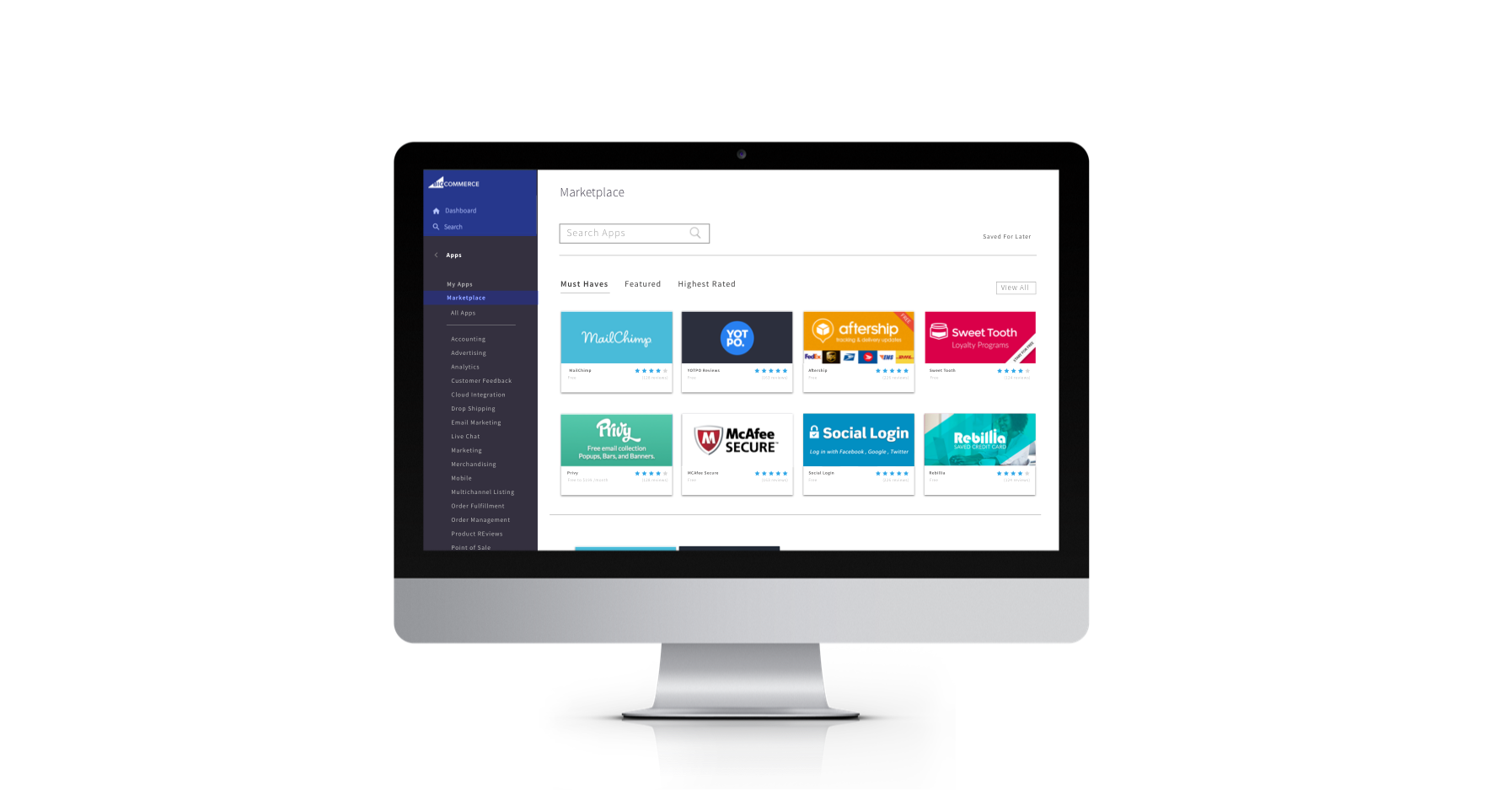
Current Marketplace
Insights
- Users were confused by having two left hand navigation bars. They mentioned that it made the website feel a bit cramped and that the space could have been used more efficiently.
- Users had a difficult time finding certain apps through the categories and would just use the search bar.
- Search bar results weren't accurate.
App Detail
Insights
- Different App descriptions had different layouts.
- The amount of text for each description was inconsistent.
- Screenshots didn't provide enough information.
- Call to Action button could have stood out more.
Reviews
Insights
- No filters for reviews.
- No Date Publication on reviews, this made some users skeptical and expressed a lack of trust.
ideal experience
After receiving all the feedback we got from their current site, we tried to focus on certain problems. We then created what we considered the "ideal experience" to help guide us during the next stage.
ideal experience
- Consistency throughout the pages
- Easier for the user to scan and process. - More Preliminary Information
- Give users more incentive to click on an app. - Improve Information Architecture
- Simplify the process to make the information easier to read and process.
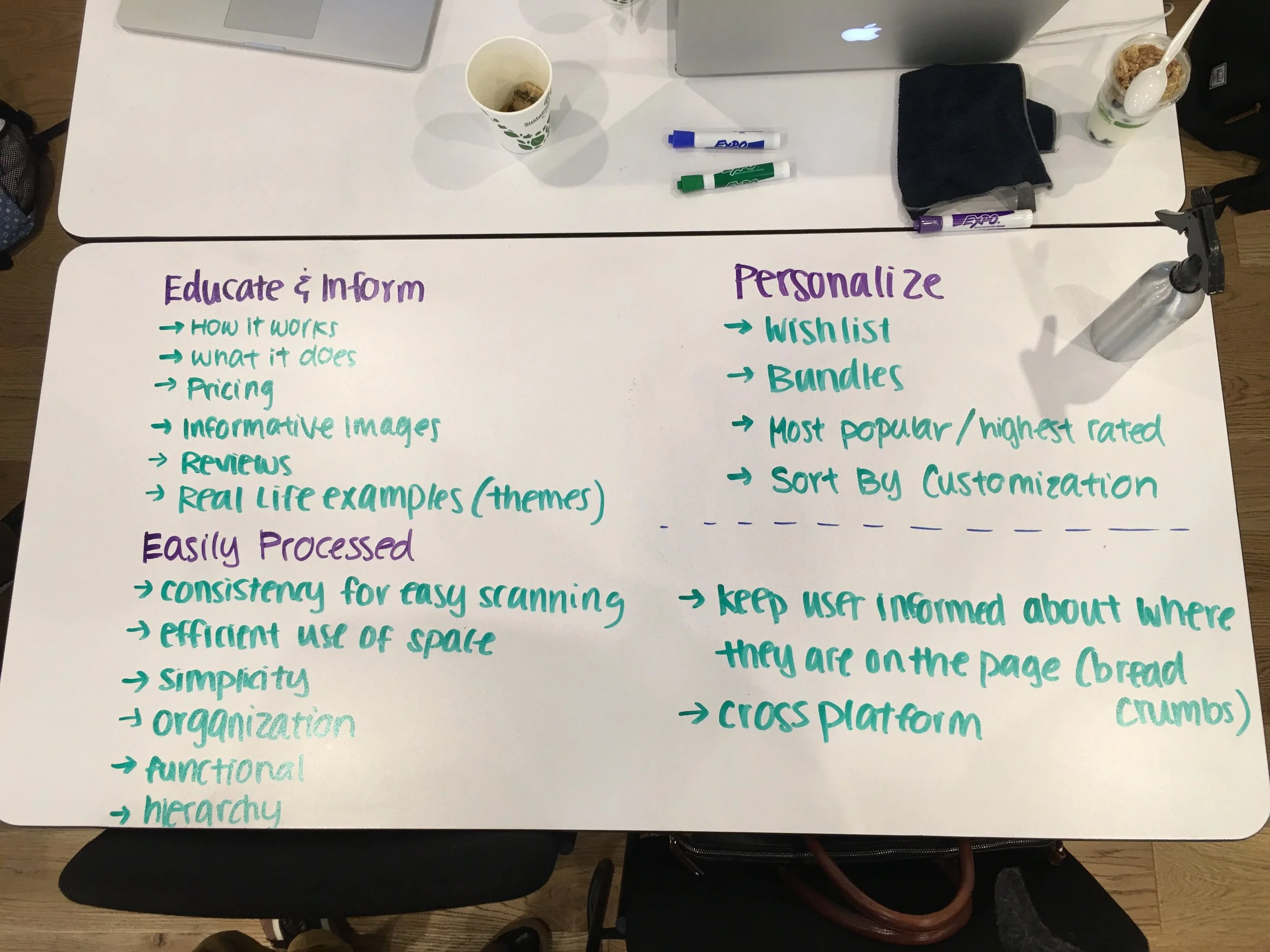
Design Principles
We created 4 design principles that we all agreed on based on the research that we compiled and the ideal experience. These four principles is what guided us through the ideation process.
consistency
simplicity
informative
efficiency
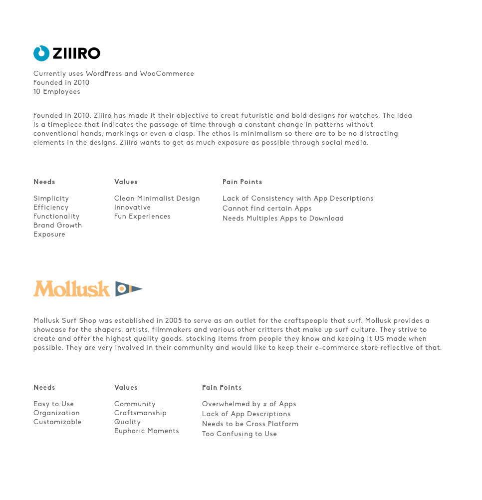
Personas
We sketched out many ideas and talked about the ideas and features that we thought would work. After discussing which features we felt would be most effective, we created some low fidelity wireframes. Once we narrowed down the options, we decided to run some simple usability test to get more feedback from the users.
ideation
Landing Page Concepts
feedback
- Users saw the search bar and liked the emphasis on it on the first concept.
- Users preferred seeing all the categories.
- In terms of layout, Concept 2 was more engaging.
Filter feature concepts
feedback
- Users preferred the second filter concept due to familiarity.
- Positive feedback on the more in depth filters on the first concept.
- Third concept was very straight forward and easy to understand.
App Detail Page Concepts
feedback
- Users preferred the clean and simplistic tabs
- Positive feedback on the enlarged Install button.
Different concepts of implementing the Reviews feature
feedback
- Users aesthetically enjoyed the pi chart but were confused as to how to read it. They were more familiar with the bar chart, because of this it was easier to process and information.
- User found the filters to be useful.
- Users also enjoyed the expanded review feature.
After conducting numerous usability test, we created more iterations. We made changes based on some of the user feedback that we had received and eventually made a clickable prototype using InVision.
I created a clickable prototype for a user who is looking to install the Mailchimp app and wants to know more about what it can do for their website.
Prototype
This project gave me an opportunity to explore the different aspects of building an e-commerce website. It gave me great insights on how different users operate and process information. It also gave me an opportunity to be more creative during the research phase. During the entire project, there were numerous iterations knowing that the product is never finished but always evolving.
With that said, these are tasks I would work on moving forward with the project...
- Continue to run more usability test.
- Implement an App comparison feature.
- Develop the check out process.
- Start iterating the mobile and tablet versions.
- Iterate the not logged in experience.